BLOG interiors + staging + lifestyle
2015 Fresh Colors in Home Design - That 70's Shade, ORANGE!
Old orange is fresh and new again.
I posted on my Facebook page the other day Elle DECOR's take on PANATONE's Spring 2015 Colors. One of the colors in the mix is an orange, Tangerine, 15-1247.
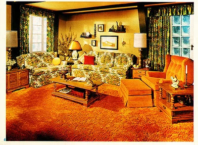
A friend responded with -" Having lived thru the 70's and seeing my mother in law's orange shag in the 'rec room' I never want to see anything remotely tangerine again."
70's Orange Shag Carpet Contempt
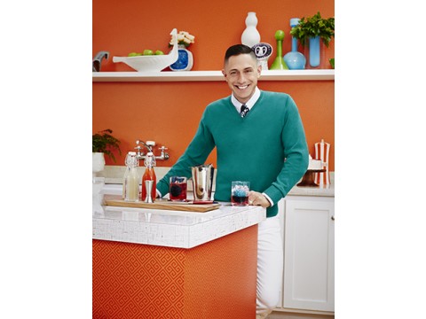
One would guess seeing acres of orange carpet, especially while visiting your mother-in-law would result in contempt for the color. But I would encourage my friend and everyone to find a renewed joy in this fantastic hue; it seems to be trending in home design everywhere. According to Chicago Tribune Real Estate columnist Mary Umberger, who just returned from the 2015 Kitchen and Bath Industry Show in Las Vegas "...orange is hot again, judging from the numerous kitchen displays that showed either accents of bright orange or whole slabs of the stuff." Counter top company, Formica Corporation enlisted iconic designer Jonathan Adler to create a new line for them, which just won a BEST of KBIS. His orange does not look like the Brady's kitchen.
Jonathan Alder for Formica Corporation
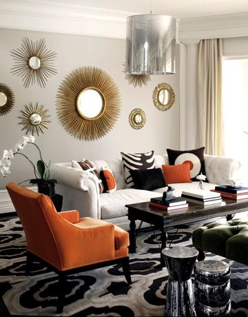
Orange in Living Room Photo (Source)
Orange is a bold color for most, so maybe taken in smaller doses. Beside dipping into it in your kitchen, why not try some orange in the rest of home's spaces with accents? Throw pillows, lamps or vases are easy choices since they are small and can add just a hint. Move on up to an area rug with a bit of the hue to create an anchor to a new palette, or take a bolder step into a statement making accent chair.
Anyway you slice it, that old 70's orange seems to be back! Maybe it will replace Black?
1. Ikat Rug - Shades of Light
2. Hot Dog Happy Pillows - Naked Decor at Wayfair.com
3. Alpaca Throw - Crate & Barrel
4. Mr. Smith Chair - Haute House at Horchow
5. Linhas Dinnerware - Anthropologie
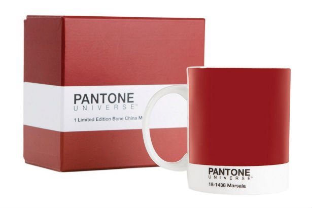
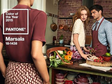
There's Something About Marsala - PANTONE's 2015 Color of the Year
PANTONE 18-1438 Marsala is a daringly inviting tone that nurtures; exuding confidence and stability while feeding the body, mind and soul.
PANTONE Marsala (Photo gallery selections: Source)
PANTONE the leading authority on color has announced their color of the year. For most, you know PANTONE by seeing the PANTONE 'color and paint' display at home improvement store Lowes. But for design insiders they are the guru's of color marketing trends - From fashion and makeup to autos and appliances, their color collections are what we see transformed into new products all over the world.
PANTONE Color Studio
So this year they selected a mellow, red/brown color "Marsala". They say: “PANTONE 18-1438 Marsala is a daringly inviting tone that nurtures; exuding confidence and stability while feeding the body, mind and soul. Much like the fortified wine that gives Marsala its name, this robust shade incorporates the warmth and richness of a tastefully fulfilling meal, while its grounding red-brown roots point to a sophisticated, natural earthiness" I like it! There's something exciting and a bit daring about the color and such a refresh change. We've already seen it in high end fashion, but could we incorporate into our home interiors?
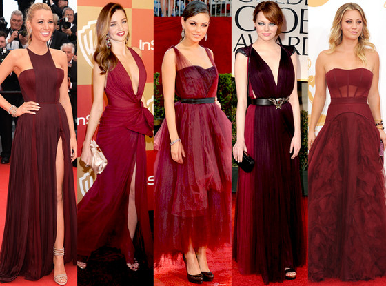
Marsala Color of the Year PANTONE - Fashion (Photo: Source)
Sure, it's the color of brick, wood tones or a rich berry paint color. So if you want to warm it up or add a bit of spice to a space - incorporate away. If you like a more neutral backdrop, try pairing the color with cooler tones, for juxtapose pairing of warm and cool.
Marsala can be translated into Home Decor options.
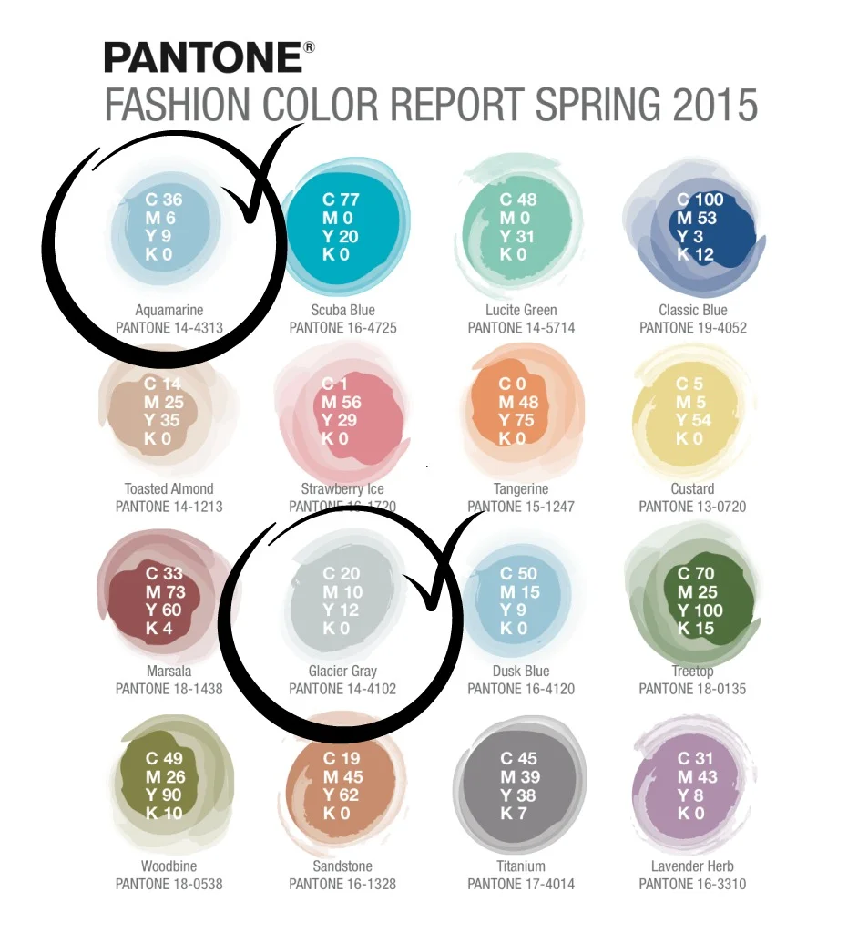
PANTONE also said to pair Marsala with two other 2015 trend colors - Aquamarine and Glacier Grey. Both of these colors have a strong presence already in home decor and perhaps already in your home. Why not add a pop up your place with easy purchased pillows, a rug or accent accessories to add a bit of Marsala to your mix?
SPRING 2015 PANTONE COLOR TRENDS
Looking to step up for more Marsala? It could be a option for creating a statement in a space. perhaps a piece of furniture, bold window treatments, or a wallpapered accent wall. Consider this new trend color and I think you too will see - there's something about Marsala.
Hooker Furniture - Bombay Chest (Photo: Hooker Furniture)
Marsala toned fabrics and textiles by Ralph Lauren (Photo: Source)
2015 Paint Trends - Sherwin-Williams
2015 Sherwin Wiliiams Color Forecast
Color forecasts are a great way to get inspired and see what will be trending from accessories to wallpapers. Sherwin Williams who partners with Pottery Barn too, showcases their picks for the upcoming year. At the end of the post, you can click on a link to see the entire palette.
-Enjoy!
As technology rushes relentlessly ahead, the colors of Chrysalis evoke a calm oasis — a place to pause and find balance. The palette, with colors ranging from off-black to chalky neutrals and dusty blues, is designed to create a more comfortable interior.
“An important influence for Chrysalis is the appreciation of earth’s natural striations,” said Jackie Jordan, director of color marketing with Sherwin-Williams. “The patterns created by land and sky are driving design inspiration, therefore the palette’s colors are found in nature, from rocks found on the beach to a stormy sky.”
Another driver is the layering and deconstruction of geometric shapes to appear soft, which parallels the monochromatic couture found on fashion runways.
From space tourism and undersea resorts, the far-fetched, sci-fi dreams of past decades are more viable than ever. The Voyage palette looks to these outer limits, featuring hues that represent the color spectrum imagined while emerging from the water into the atmosphere – undersea teal, bright green kelp, light watery blue and deep space purple.
“The colors of Voyage are supernatural and magical,” Jordan said. “The palette is largely driven by unusual atmospheric events, including a decade-best aurora borealis that will be keeping our eyes focused on the heavens. The lighter colors of the palette create a space that is uplifting, while the deeper tones can be combined for a more dramatic design.”
“We’ve weathered the recession and are finally seeing hopeful signs of growth and expansion,” Jordan said. “Our revived good spirits echo the optimism that followed World War II, when GIs returned home from exotic locales, bringing a wave of tropical prints and tiki-inspired looks. Like that era, we’re expressing our enthusiasm with big, bright florals in fashion and interiors.”
The colors of Buoyant are reminiscent of vintage floral patterns – light and deep greens, violets and a pop of coral. In addition to renewed optimism, the palette is also inspired by the natural healing of botanicals, as well as the incorporation of green spaces into even the most densely urban environments. Backyards, once a landscaping afterthought, are now as important as front yards, with builders investing in rear “curb appeal” and outdoor rooms.
From bold, ethnic-inspired colors and designs to the Bohemian lifestyle, the Unrestrained palette celebrates a carefree spirit, wanderlust and pulsing color. The palette features saturated primary hues, including sunny yellow, lively turquoise and bright blue, as well as black and white. Each can be used on its own for a pop of color, or combined, to create a vibrant, energetic space.
“South Africa’s colorful art scene and focus on the 2016 Summer Olympics in Rio de Janeiro have strongly influenced a Carnival-like spirit,” Jordan said. “This spirit is inspiring design with a zest for life, and the vibrant colors of Unrestrained are a reflection of that design aesthetic.”
