BLOG interiors + staging + lifestyle

Survey Says! 2021 Home Colors When Selling
A recent Zillow survey reveals which colors may attract more prospective buyers — and higher offers — when you're getting ready to sell.

A recent Zillow survey reveals which colors may attract more prospective buyers — and higher offers — when you're getting ready to sell.

Here are my picks :
Light Blue Bathroom Sherwin Williams Sea Salt : Calming, lovely and the perfect combo of blue and green. ( Bonus. With 2022 color trends leaning towards the green palette, this hue bridges both years.
White Kitchen - Benjamin Moore White Dove : Soft, collective, especially if there are wood tones floating about the home. White Dove is a perfect choice for walls, cabinets or trim.
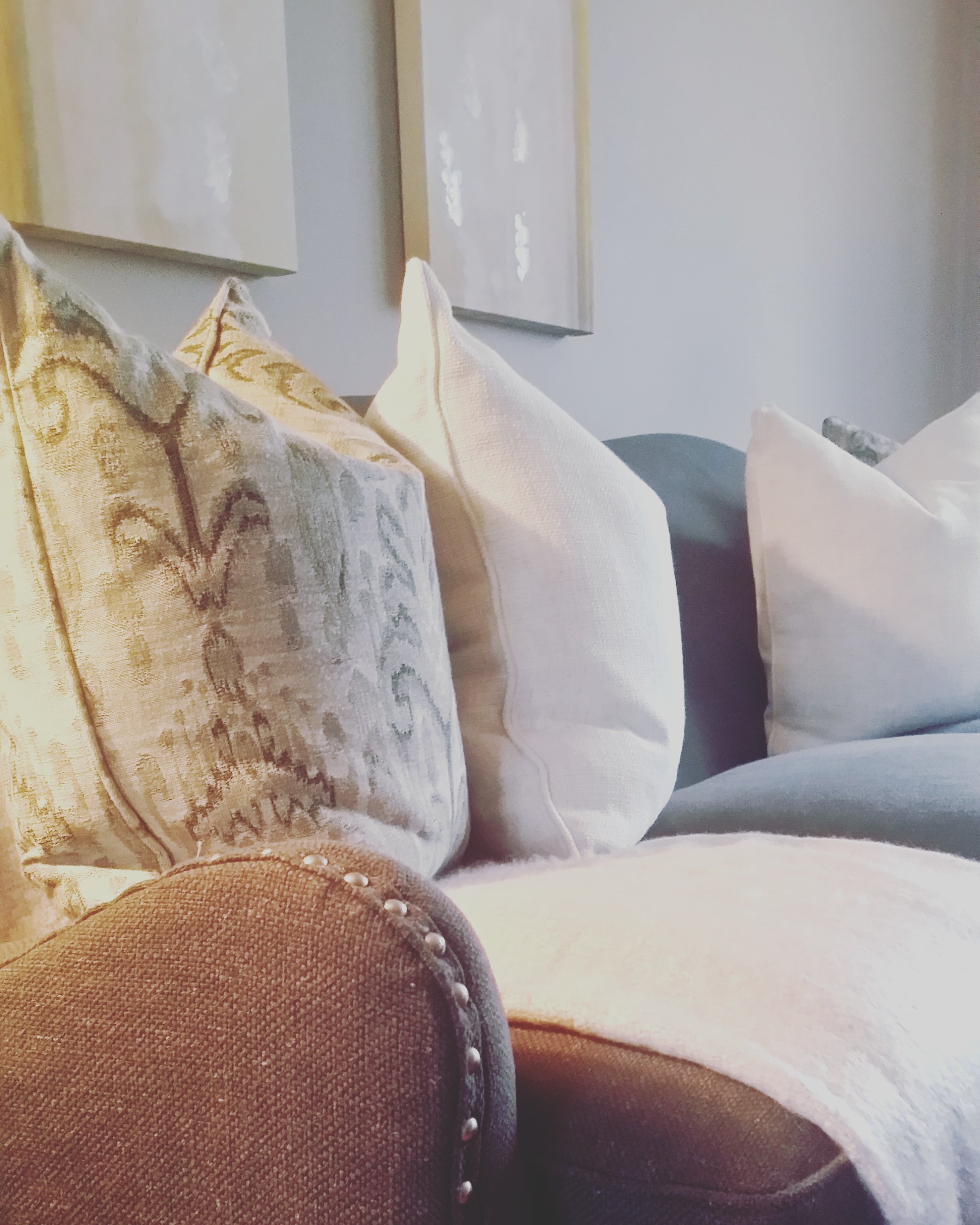
Gray Living Room - Benjamin Moore Edgecomb Gray : A greige color with warm and once again looks good on the walls with wood tones and marries well with furniture that is already in the home.
Dark Blue Primary Bedroom - Sherwin Williams Naval : A recent color of the year for Sherwin Williams. Besides looks great in a bedroom, and if you want to play it safe, as an accent wall - this ‘everyone love navy’ color looks stunning as a front door color and can break up an all white kitchen as the island color.

Whether selling or dwelling, my color expertise can help you sell your home and update, refresh and revive your space for 2022. Call or text @ 708.543.8597. - Julea

Home Office Paint Colors for Home Schooling
For any age, a home schooling environment should be conducive to focus and concentration, while infusing color moments that can spark creativity.
I was lunching (al fresco of course) with my friend and Benjamin Moore paint associate Mary Hoffman the other day. As we were catching up and discussing 2020, one of our talking points was how many of my clients have inquired about creating a great home office and e-learning environment. Delightfully in the e-mail yesterday came this wonderful, expert advice from Benjamin Moore’s corporate Color Director.
For any age, a home-schooling environment should be conducive to focus and concentration, while infusing color moments that can spark creativity. Creating this balance with wall color s is important to avoid boredom or creating a space that may be too aggressive for school-related activities. It is also important to take the other elements into consideration – beyond furniture and flooring, to include school-related supplies, accessories and other moments that may be good ways to introduce bold or saturated color, while maintaining a backdrop that is not distracting.
Pre-school: There are two directions one can take with this age group. I think a very pale blue like Polar Ice 1660 or a soft yellow like Fresh Air 211 would be a nice backdrop. Another option is a warm white like Mountain Peak White OC-121 as a wall color with accents in primary hues coming from furnishings and small accents, and even toys/teaching tools. That way there is a balance between lively colors that are eye catching and a wall color that is subdued and will not distract kids, especially when young attention spans are limited.

Elementary: There is a pretty wide range for elementary students as they could be just a step up from pre-school, or on their way to Jr. High. A soft green could be nice, like Spring Valley 438 or maybe Cedar Grove 444 for something slightly darker. I also like Mt. Rainier Gray 2129-60 and Breath of Fresh Air 806. Again, the wall color can be the back drop for other things happening in the space from furniture, to school supplies, to even white boards or bulletin boards with school-related items on it. I’d also suggest using chalkboard paint in spots where it makes sense, using a darker color so the chalk stands out well, for instance Downpour Blue 2063-20 or maybe Jack Pine 692.

Jr High: Now that the student is getting a bit older, the wall colors that will be appealing and will create an atmosphere conducive for studying may be a bit more nuanced. A few colors that may appeal to this age group include Wales Gray 1585, Airway 828, Stonington Gray HC-170, or Vintage Taupe 2110-70. There may also be opportunities for a “whiteboard” with notable, so a lighter color will work best to show off dry erase markers.

High School: With tastes becoming more sophisticated and different school demands, the palette may expand to include some darker hues, and even variations on white for a modern look that also lends itself to schooling. On the darker end of the spectrum, Van Deusen Blue HC-156 or Chelsea Gray HC-168 are nice choices, while Simply White OC-117 and Cloud Cover OC-25 could also work well. Other options that appeal to this age group include Smoke Embers 1466, Gentle Gray 1626, or Ocean Air 2123-50.


Benjamin Moore Dry Erase Board Paint: Transform Any Wall Color Into a Dry Erase Board with Notable Dry Erase Paint. Find Your Perfect Color.
BEN® CHALKBOARD PAINT - Chalkboard Paint, available in any color, lets you turn virtually any interior surface into an erasable chalkboard.
Excitedly, I met with a new design client last week and picked Benjamin Moore’s Pale Smoke 1584 for her home office. I’ll be following up this post with my picks and home styling suggestions for her home office re-boot in another blog post. Stay tuned! - Julea
Have a decorating dilemma? You may be looking for some decorating or remodeling guidance, validation, or you are struggle with just pulling it all together. My 2 hour design consultation is a great option to meet your goals. Call or text Julea @ 708.543.8597.